5 Key Website Features That Drive Conversions
Getting people to visit your website is only half the battle: the real challenge is what happens once they arrive. In New Zealand’s crowded digital market, attention is the most valuable currency you have. If your site feels like a maze or takes too long to load, you aren't just losing a click; you are handing a potential client straight to your competition. To win in 2026, your online presence needs to be more than just a digital signpost; it needs to be a precision-engineered environment designed for action.
Research into the highest-performing websites shows that well-designed user experience (UX) can boost conversion rates by up to 400 percent.¹ At Verum, we focus on removing the friction between a customer's problem and your solution. Here are the five essential elements that move the needle for New Zealand businesses and help turn digital traffic into measurable revenue.
1. Intent-First Navigation
A website that is easy to navigate keeps visitors around longer. No one wants to click through a confusing architecture. In 2026, high-performing websites have moved beyond simple organisation toward intent-first layouts.² This means removing roadblocks at every step: every section, button, and scroll point must serve a clear purpose.
If finding information on your site feels like fighting a constant headwind, visitors will leave out of frustration. Research indicates that 79 percent of users stop using a digital interface due to confusing or cumbersome navigation.³ To make your navigation intuitive, you should use simple, descriptive labels and ensure that any critical page is no more than two or three clicks away from the homepage.
Kiwibank provides an excellent example of this through their brand strategy. They use cultural symbols, or tohu, to represent specific pathways for the customer journey: Be Bold, Know How, and Show Heart.⁴ By aligning their navigation with these clear intent nodes, they help users find exactly what they need without the typical corporate noise. When you reduce cognitive load, you help your visitors focus on their goals rather than figuring out how to get there.
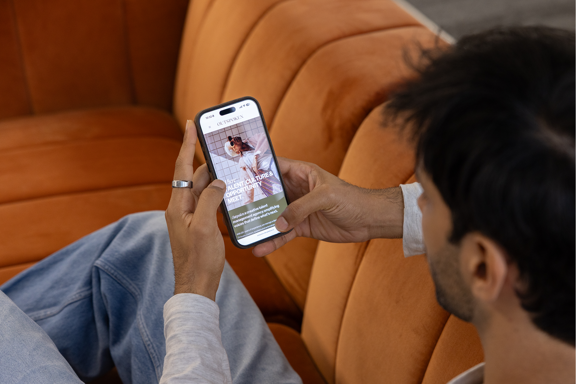
2. High-Trust Visuals and Social Proof
First impressions online are formed in just 47 milliseconds: that is faster than the blink of an eye.¹ In that tiny window, a visitor’s brain judges your professionalism, credibility, and quality. Studies show that 94 percent of these first impressions are design-driven, meaning your look and feel establishes trust before a single word is read.⁵
Clean, professional design with high-quality, original visuals signals that you are a reliable business. For New Zealanders, authenticity is everything. Fisher & Paykel has mastered this by creating a sophisticated visual language that captures their spirit of innovation.⁶ Their design heritage is built on a culture of curiosity that is reflected in everything from their appliance styles to their digital experiences.⁶ They use high-resolution visuals to create depth and a sense of visual tactility, making the user feel like they are interacting with a premium product even through a screen.
Equally important is the use of social proof. Testimonials and reviews are no longer optional extras; they are essential trust-builders. Whittaker’s is a masterclass in this area. By relentlessly focusing on their "Good Honest" values and bean-to-bar philosophy, they have been voted New Zealand's Most Trusted Brand for 14 years in a row.⁷ Their website leverages this reputation by showcasing their heritage and ethical sourcing, which reassures new visitors that the business delivers on its promises. This is a core part of building brand identity that resonates with your specific audience.
3. Precision Calls-to-Action (CTAs)
Every effective website needs to guide visitors toward the next step. This is where clear, strategic calls-to-action come in. A CTA is the friendly signpost that tells the user what you want them to do next, whether it is requesting a quote or booking a consultation.
To drive conversions, your CTAs need to be direct and action-oriented. Use text that leaves no room for doubt, like "Get Started" rather than "Learn More." Position these buttons where they are easy to find; statistics show that users spend 57 percent of their time viewing content above the fold, so your primary CTA should be visible without the need for excessive scrolling.⁸
In 2026, we are also seeing the importance of personalising these CTAs based on user behaviour. Barkers Clothing provides a strong example of precision in their digital strategy. By moving away from general keyword campaigns and focusing on high-intent Shopping Ads that display product images at the top of the search page, they increased their online revenue by 263 percent over a single quarter.⁹ Their digital experience is built to present the right product to the right person at the moment they are ready to act, removing the guesswork from the sales process.
4. Zero-Wait Performance
New Zealanders are busy, and their patience for slow websites is at an all-time low. If your site is slow, you are likely losing half your audience before they even see your logo. Research indicates that 53 percent of visitors will abandon a mobile site if it takes longer than three seconds to load.¹⁰
Every second counts. For every second a site loads faster, conversion rates improve by an average of 17 percent.¹¹ In 2026, speed is not just a technical metric; it is a brand value. Slow equals careless, while instant equals premium. To strengthen your performance, you should:
- Compress images and use modern formats like WebP or AVIF.
- Minimise bulky code and unnecessary third-party scripts.
- Use reliable, dedicated hosting rather than shared resources.
A fast site is not only better for your visitors; it is also a major ranking factor for search engines. You can learn more about how speed and technical health fit into your broader visibility plan here.
5. Instant Connectivity and the Power of Chat
The majority of digital interactions in New Zealand now happen on a smartphone screen. A truly mobile-friendly site does not just shrink a desktop layout; it rethinks the journey for a thumb-driven, task-oriented user.¹²
Furthermore, New Zealanders are increasingly moving away from traditional contact forms. If a customer has a question, they expect to be able to reach you instantly via a mobile-friendly channel like WhatsApp, Instagram DM, or live chat. A site that hides these contact points or makes them difficult to tap actively drives the majority of your potential leads to a competitor who offers a smoother, faster interaction.
This is why we often suggest integrating a communication platform like Intercom. It acts as a digital co-pilot for the customer journey, moving away from guessing by using real-time insights to engage visitors effectively based on their behaviour.¹³ Data shows that website visitors are 82 percent more likely to convert to customers if they have chatted with you first.¹³ In an environment where over half of consumers expect a response within one hour on digital channels, this instant connection is a vital trust-builder.¹⁴ You can learn more about how this works in our post on how Intercom helps you understand and grow your customers.
A Practical Checklist for Website Excellence
If you are wondering if your current site hits the mark, here are the key signals to look for:
- Readable text: ensure your font is legible without zooming, typically a minimum of 16px.¹⁵
- Touch-friendly navigation: buttons and links should be large enough to tap easily with a thumb (at least 44 by 44 pixels).¹⁶
- Content parity: all your important information must appear on the mobile version of your site.¹⁰
- Fast loading: aim for your main content to load in under 2.5 seconds to keep users engaged.¹⁷
- Simplified forms: minimise the number of fields in your contact forms to make them easier to complete on a small screen.¹⁶
Building for the Future
Your mobile presence is effectively your brand's most frequent handshake. It is the interaction your customers carry with them throughout their day, and choosing a mobile-first direction shows that you respect their context and their time. By making that journey effortless, you give them every reason to choose you before they have even spoken to your team.
At Verum, we focus on building digital experiences that capture the specific habits of New Zealanders. We ensure your site is not just technically compliant with Google's standards, but is a genuine reflection of your vision and values. If you want to turn your online presence into a sustainable growth engine for your business, let's talk. We can grab a coffee and figure out how to make your website work harder for you.
References
1. eDesign Interactive. (2026). Trust in 47 Milliseconds: The Rapid Impression.
2. Mindspace Tech. (2026). Top Web Design Trends 2026: Intent-First Design.
3. Google. (2018). Mobile UX Design: Confusing Navigation and User Abandonment.
4. Kiwibank NZ. (2022). Our Brand: Building on Our Legacy.
5. VWO. (2026). UI/UX Design Statistics: First Impressions and Conversions.
6. Strategy NZ. (n.d.). Fisher & Paykel: A Legacy of Innovation and Design.
7. Trusted Brands NZ. (2025). Whittaker's: New Zealand's Most Trusted Brand for 14 Years.
8. VWO. (2026). On-Page Web Design Statistics: Above the Fold and CTA Placement.
9. WebAntler. (2021). Barkers Case Study: Increasing Online Revenue via Shopping Ads.
10. Tenet. (2026). Website Speed and Load Time Statistics: Mobile Abandonment.
11. Email Vendor Selection. (2026). Website User Experience Statistics: The 17% Rule.
12. Activate NZ. (2026). Kiwi Website Design Best Practices: Local Signals.
13. Verum NZ. (2025). How Intercom Helps You Understand and Grow Your Customers.
14. UXTweak. (2026). UX Statistics: Response Time Expectations.
15. Lucid Media. (2026). The Biggest SEO Mistakes to Avoid: Neglecting Mobile.
16. WP Brigade. (2026). How to Create Better Mobile-First User Experiences.
17. Spiral Compute. (2026). Essential Website Optimisation Priorities for NZ.

